
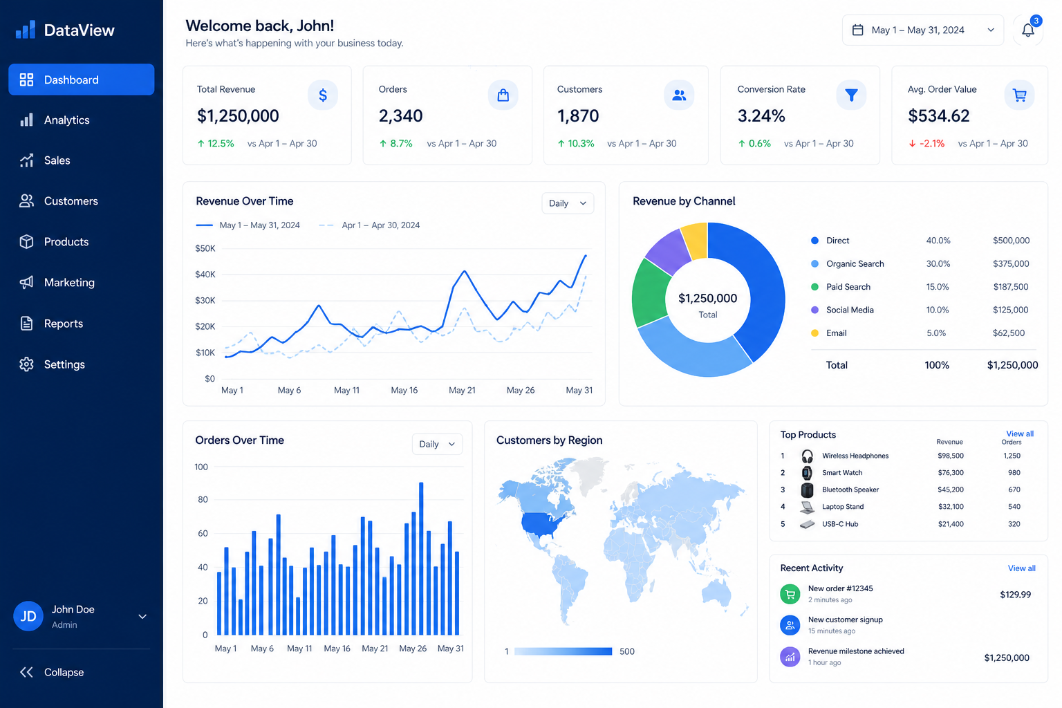
In today’s data-driven business environment, having access to the right information at the right time isn’t just advantageous—it’s essential. But raw data alone won’t drive your business forward. You need decision-ready dashboards that transform complex data into clear, actionable insights.
Whether you’re a business analyst, manager, or executive, learning how to build effective dashboards can revolutionize your decision-making process. In this guide, we’ll walk you through five proven steps to create dashboards that don’t just display data—they drive action.
What Makes a Dashboard “Decision-Ready”?
Before diving into the how, let’s clarify what separates a good dashboard from a decision-ready dashboard.
A decision-ready dashboard:
- Presents relevant KPIs aligned with business objectives
- Displays data in an intuitive, easy-to-understand format
- Updates in real-time or near real-time
- Highlights anomalies and trends automatically
- Enables quick interpretation without extensive analysis
- Supports specific decision-making scenarios
Unlike traditional reports that simply present historical data, decision-ready dashboards are designed for action. They answer critical questions at a glance and empower stakeholders to make informed decisions quickly.
Step 1: Define Your Decision Objectives
The foundation of any effective dashboard lies in clarity of purpose. Before you touch any dashboard design tool, you need to answer one critical question: What decisions will this dashboard support?
Key Actions:
Identify Your Users Different stakeholders need different information. A C-suite executive needs high-level strategic metrics, while an operations manager requires detailed tactical data. Understanding your audience is crucial for creating user-centered dashboards that actually get used.
Map Decisions to Metrics For each decision your dashboard will support, identify the specific metrics that inform that decision. For example:
- Decision: Should we increase marketing spend?
- Metrics: Customer acquisition cost, conversion rates, ROI by channel
Establish Success Criteria Define what success looks like for each metric. Is a 5% conversion rate good? What about 10%? Without clear benchmarks, your dashboard is just displaying numbers without context.
Pro Tip: Start with no more than 3-5 key decisions per dashboard. Overloading your dashboard with too many objectives dilutes its effectiveness and confuses users.
Step 2: Select the Right KPIs and Data Sources
Not all data is created equal. The difference between a cluttered, confusing dashboard and a decision-ready dashboard often comes down to disciplined KPI selection.
Choosing Effective KPIs
Follow the SMART framework when selecting KPIs:
- Specific: Clearly defined and focused
- Measurable: Quantifiable with available data
- Achievable: Realistic given your resources
- Relevant: Directly tied to your decision objectives
- Time-bound: Trackable over meaningful periods
Data Source Integration
Your dashboard is only as good as the data feeding it. Ensure your data sources are:
- Reliable: Consistent and accurate
- Accessible: Available for real-time or scheduled updates
- Compatible: Able to integrate with your dashboard platform
- Clean: Free from duplicates and errors
Learn more about data quality best practices to ensure your dashboards are built on solid foundations.
Common KPI Categories by Department:
Sales:
- Revenue growth
- Pipeline value
- Conversion rates
- Average deal size
Marketing:
- Lead generation
- Campaign ROI
- Customer acquisition cost
- Engagement metrics
Operations:
- Production efficiency
- Quality metrics
- Cycle time
- Resource utilization
Finance:
- Cash flow
- Profit margins
- Budget variance
- Burn rate
Step 3: Design for Clarity and Action
Great dashboard design isn’t about making things look pretty—it’s about reducing cognitive load and enabling quick comprehension. Your dashboard design principles should prioritize function over form.
Visual Hierarchy Matters
Arrange information based on importance:
- Top/Left: Most critical KPIs (people read left-to-right, top-to-bottom)
- Center: Trend visualizations and comparisons
- Bottom/Right: Supporting details and contextual data
Choose the Right Visualizations
Match your chart type to your data story:
Data Relationship | Best Visualization |
|---|---|
Trends over time | Line chart |
Comparisons | Bar chart |
Composition | Pie/donut chart (use sparingly) |
Distribution | Histogram, box plot |
Correlation | Scatter plot |
Performance vs. target | Gauge, bullet chart |
Color Strategy
Use color purposefully:
- Consistency: Use the same color for the same metric across all visualizations
- Contrast: Highlight important data points or anomalies
- Accessibility: Ensure colorblind users can interpret your dashboard
- Restraint: Limit your palette to 3-5 colors maximum
White Space is Your Friend
Don’t cram every inch of screen space with data. Strategic white space:
- Reduces visual clutter
- Improves readability
- Draws attention to important elements
- Creates a professional appearance
Step 4: Build and Integrate
Now it’s time to bring your dashboard to life. Whether you’re using Tableau, Power BI, Google Data Studio, or another platform, these implementation principles apply universally.
Technical Considerations
Real-Time vs. Scheduled Updates Determine how fresh your data needs to be:
- Real-time: Critical for operational dashboards (monitoring systems, trading floors)
- Hourly/Daily: Suitable for most business performance dashboards
- Weekly/Monthly: Appropriate for strategic dashboards
Performance Optimization A slow dashboard is an unused dashboard. Optimize performance by:
- Limiting the data range displayed
- Using aggregated data where possible
- Implementing efficient database queries
- Caching frequently accessed data
Mobile Responsiveness Decision-makers don’t always sit at their desks. Ensure your dashboard works seamlessly across devices—desktop, tablet, and mobile. Discover more about mobile dashboard optimization for on-the-go decision making.
Integration Checklist
- Connect to all necessary data sources
- Set up automated data refresh schedules
- Configure user access permissions
- Test data accuracy against source systems
- Set up alerts for data pipeline failures
- Document data definitions and calculations
Step 5: Test, Iterate, and Drive Adoption
Your dashboard isn’t finished when it’s built—it’s finished when it’s driving decisions. This final step is where many organizations fail, but it’s also where the real value is realized.
User Testing
Before rolling out your dashboard widely:
- Conduct usability testing with representative users
- Gather feedback on clarity, relevance, and ease of use
- Observe how users interact with the dashboard—where do they look first? What confuses them?
- Test decision scenarios—can users actually make the intended decisions?
Adoption Strategies
Building it doesn’t mean they will come. Drive adoption through:
Training and Documentation
- Create quick-start guides
- Offer live training sessions
- Record video tutorials
- Establish a dashboard glossary
Executive Sponsorship When leaders actively use and reference the dashboard in meetings, adoption follows naturally.
Continuous Improvement Establish a feedback loop:
- Schedule regular check-ins with users
- Monitor usage analytics
- Track which visualizations are most/least used
- Update metrics as business priorities evolve
Learn how to measure dashboard ROI to demonstrate the value of your business intelligence initiatives.
Common Pitfalls to Avoid
❌ Dashboard sprawl – Creating too many dashboards without governance
❌ Set it and forget it – Failing to update as business needs change
❌ Ignoring user feedback – Building what you think users need vs. what they actually need
❌ Over-complication – Adding unnecessary features that confuse rather than clarify
Putting It All Together: Your Action Plan
Building decision-ready dashboards is a journey, not a destination. Here’s your roadmap:
Week 1-2: Define objectives and identify stakeholders Week 3-4: Select KPIs and audit data sources Week 5-6: Design wireframes and get stakeholder approval Week 7-8: Build initial version and conduct user testing Week 9-10: Refine based on feedback and launch pilot Ongoing: Monitor usage, gather feedback, iterate
Ready to Transform Your Decision-Making?
Decision-ready dashboards aren’t just nice to have—they’re essential for staying competitive in today’s fast-paced business environment. By following these five steps, you’ll create dashboards that don’t just display data, but actually drive better decisions.
Remember: the best dashboard is the one that gets used. Keep your users at the center of every design decision, and you’ll build tools that truly make an impact.